A Doorway Moment, Real Numbers, and a Simple Question
You know that split second when a guest walks in and decides how the place feels? Reception Desks set that tone almost instantly. Picture a lobby at 8:45 a.m., three arrivals per minute, with staff trying to triage questions while phones ping. Now consider a u shaped reception desk guiding traffic into clear lanes versus a long, flat counter that turns into a crowd magnet. Facility studies put wait-time tolerance near the two-minute mark before people get fidgety (or they bail to self-serve). So, which layout keeps lines moving and brand vibes intact? And which one makes the team’s day easier? (That second part matters more than most plans admit.) The real question isn’t only style—it’s flow, ergonomics, and operational clarity. We’ll compare how shape affects throughput, how millwork choices change durability, and how cable management and power grommets keep the chaos hidden—while staying ADA-clear and friendly. Stick with me as we break down where the friction lives and how a smarter footprint pulls it out, piece by piece. Next up: what traditional setups miss—and why it slows everyone down.
Under the Hood: Where Traditional Setups Fall Short
Why do straight counters bottleneck?
Here’s the technical truth: a straight, single-transaction counter forces a single queue and a single decision point. That means one staffer becomes the router for everything, and micro-delays stack fast. Sightlines get blocked, ADA clearance zones compete with waiting areas, and there’s no natural “handoff” from greet to process to closeout. In a U shape, the geometry gives you three micro-stations: intake, action, and exit—each with a clean work triangle. Look, it’s simpler than you think. Staff can pivot between tasks without crossing paths, while guests see where to stand, where to sign, and where to head next. Add a small privacy panel, and you get better acoustics and data discretion without building a wall—funny how that works, right?
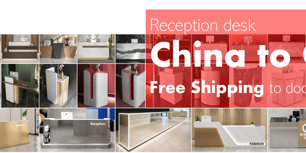
Material and build choices compound the problem in older layouts. Thin laminate at the edge chips under bag strikes; no kick plate means scuffs on day one; and messy power strips kill credibility at eye level. A U-shaped core with solid surface tops, a load-bearing frame, and modular joinery lets you route power converters and data neatly, drop in power grommets at each bay, and keep cable management invisible. That also keeps serviceable parts accessible without tearing into the face panels. The result: fewer step-backs for staff, fewer “where do I go?” moments for guests, and cleaner compliance with daily use—everything a good reception needs but too many counters ignore.
Comparative Outlook: Tech-Ready U‑Shapes and Real‑World Gains
What’s Next
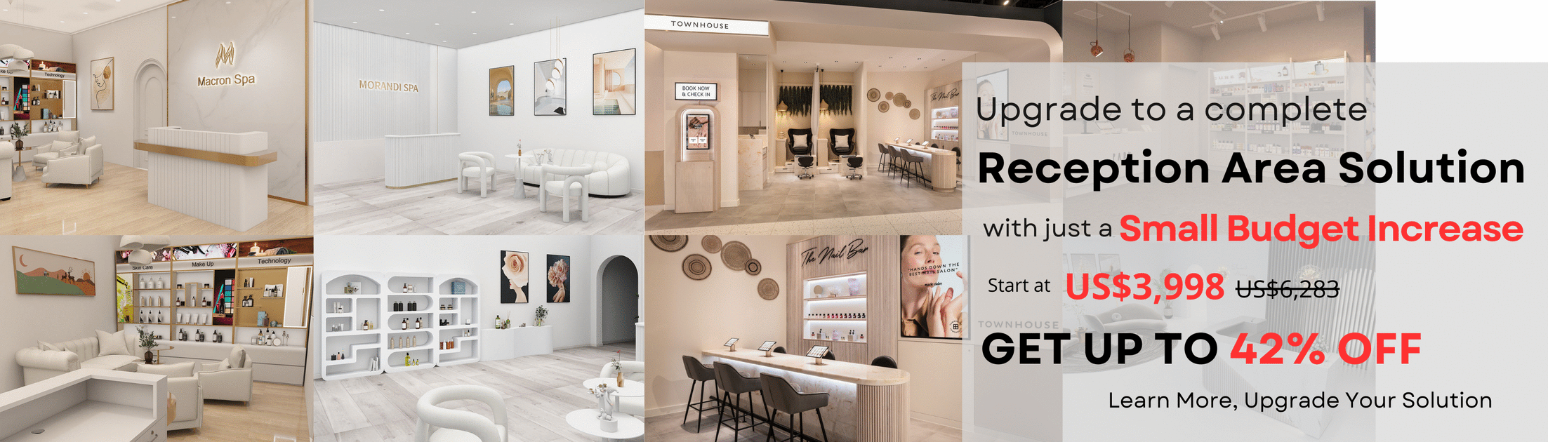
Let’s look forward. The most useful U-shapes are acting like small command hubs, not just furniture. Think check-in tablets seated at intake, a transaction counter with a scanner, and a corner bay for quick self-serve. Newer installs are pairing BLE beacons with QR onboarding and neat PoE power converters tucked below, so staff can shift from active to assisted modes without moving guests around. In one multi-tenant lobby, reworking a linear counter into a U cut average wait by 28 percent and made wayfinding obvious—no signs needed. If you’re in personal services, the same logic works for a beauty salon counterr: greet on the short leg, book and bill at center, retail closeout on the return. It’s a simple loop. But the loop changes everything—less backtracking, more face time, fewer dropped steps.
So how do you choose? Keep it semi-formal and measurable. First, throughput per bay: can your team process two tasks in parallel without cross-talk? Second, serviceability: can you access millwork panels, power grommets, and data runs without downtime? Third, human factors: are your ADA clearance, reach ranges, and sightlines right for both guests and staff? Summed up, the U-shaped footprint aligns traffic with task flow, hides the mess, and scales with tech without feeling “techy.” It’s the rare case where better ergonomics also look better—because clarity reads as quality. If you need a single takeaway, it’s this: design the path, and the experience follows. For more grounded specs and build logic, see M2-Retail at M2-Retail.
